
Earlier this year, I started a new tutorial piece on my blog called Tutorial Tuesday. The intent is to stretch our shooting and editing skills...and since I am constantly trying to learn something new with regard to my own processing, I've had a blast picking up new tools for my bag of tricks. A few weeks ago, I shared a tutorial on vintage processing. I thought it might be interesting to revisit that tutorial using a different image for muse university.
In order to fully utilize this tutorial, you'll need some version of Photoshop. Although most of the steps can be performed in Photoshop Elements, there will be a couple of steps in this tutorial that will not work for PSE users (still try it - I'll offer some alternative approaches). If you're more of a video tutorial kinda person, click HERE.
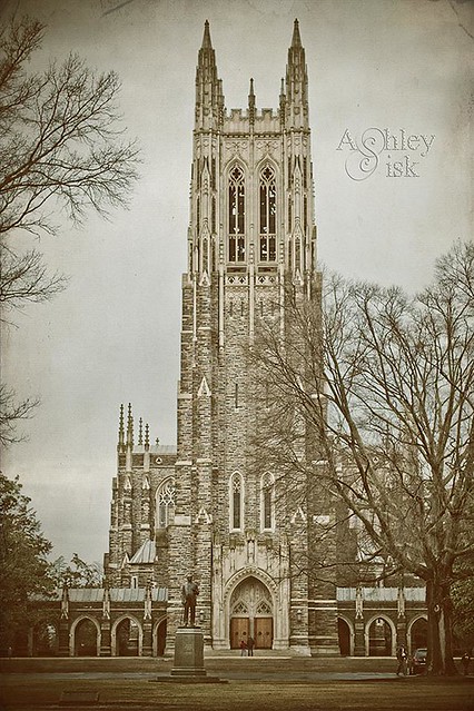
Here's my original shot (taken at Duke Chapel in Durham, NC earlier this year):
In order to fully utilize this tutorial, you'll need some version of Photoshop. Although most of the steps can be performed in Photoshop Elements, there will be a couple of steps in this tutorial that will not work for PSE users (still try it - I'll offer some alternative approaches). If you're more of a video tutorial kinda person, click HERE.
Here's my original shot (taken at Duke Chapel in Durham, NC earlier this year):
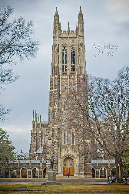
For many of you, the original image looks great and you would upload to Flickr and be done. I completely appreciate those who prefer a clean and natural approach (it's much quicker and easier). But for those of us that like to do a little more, creative processing has a lot to do with individual preferences. In particular, I think with vintage processing, it all depends on your mood. And it's funny, because so many times, the images that inspire us to go "vintage," weathered naturally over time. Nonetheless, let's learn a new effect.
Step 1: Create a duplicate of your background layer. You won't use this one right now, but this creating a duplicate layer is just good practice when editing.
Step 2: Create a Color Balance adjustment layer. (This is the one adjustment layer that will not work for Photoshop Elements' users - you can tinker around with a saturation adjustment instead.)
- Shadows = -45, 25, -5
- Midtones = 0, 20, -5
- Highlights = -25, -15, -20

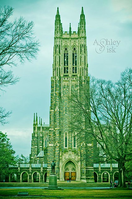
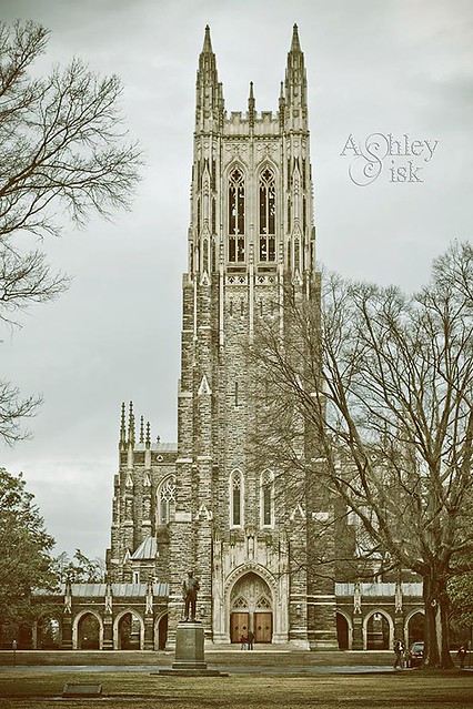
Step 4: Create a Gradient Map layer. Be sure that reverse is unchecked (although I seem to recall that the video said to check it...didn't look right to me). You'll want to change the color of your gradient to something within the orange/brown range. Click okay and then lower your opacity. The video suggests an opacity of 80%...I lowered mine to 74%. I'm not sure there is a perfect formula for this step - just experiment with it until you see something like my image below.
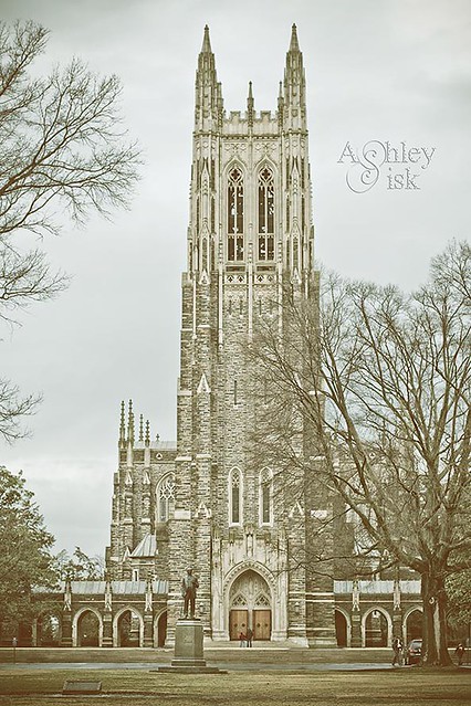
Step 5: Create a Levels adjustment. Here, you'll want to drag your shadows and midtones to the right just a bit. The video pulled them to 17 and 0.73.
Step 6: Go back to the duplicate of your background layer (just above your background layer). Go to Filter > Enable Smart Filters.
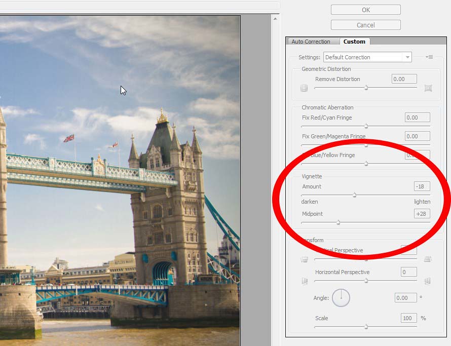
Step 7: (same layer) Go to Filter > Select Lens Correction. On the right hand side, scroll down to vignette. Pull the vignette slider to -52 and the midpoint slider to +34. (obviously this image was taken while processing a different photo)

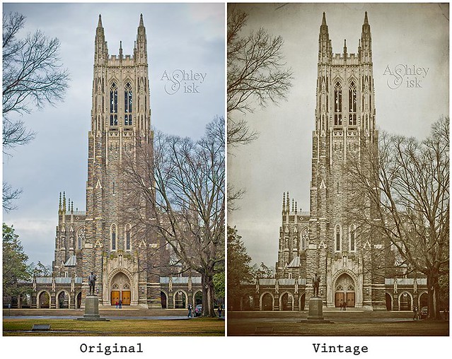
With that said, that's the vintage effect. What do you think? Would you rather just download an action? Here's a link: click HERE. Just in case you forgot, here's my original image on the left and the final vintage edit on the right. Feel free to give this tutorial a try and share your image with us in the comment section.
3 comments:
great tutorial. i think people will learn more from this than just vintage processing about layers, gradient maps, etc...maybe things they didn't know how to use on ps before!
Yep, like the vintage version very much. I do tend toward using this approach when I make cards, it makes them less photo-y and more memory.
Pure magic, Ashley! I do love any excuse to have a play on photoshop and will most definitely be giving this a go! Thank you.
Post a Comment
thank you for visiting. take a moment and say hi!