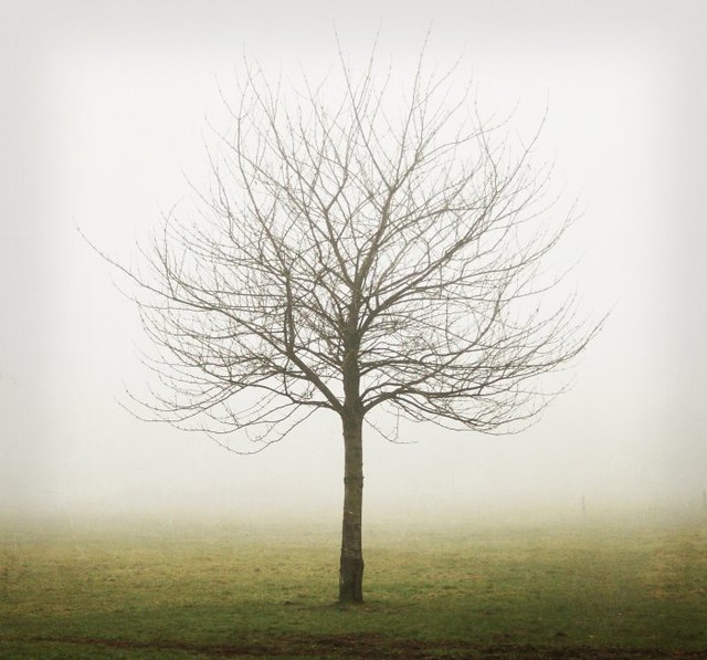
Tree in mist with texture by barbara.jackson55
We just finished up musing on geometric shapes in images, which was great fun! But what about the shape of the frame? We often stick with the format of our digital cameras, usually 3:2 or 4:3, as our frame shape. We're going to break out of that habit for this theme - it's time to work with the SQUARE!
With digital photography it is so easy to play around with square format. You can use your camera phone...
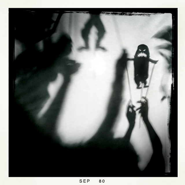
silhouettes by kirstinmckee (using Hipstamatic app)
... or try the ttv (through the viewfinder) technique. (See more on ttv in this muse university post.)
ttv_pear by à la mosey
You can compose square images by cropping in your post processing or work on composing them in-camera, using some ideas in the muse university post below on square format. The possibilities with the square are endless! You can put your square format photos in the Flickr pool starting today.
Join us tomorrow, as we begin musing on self portraits. It's time to see the faces behind the cameras around here!
kat of The Kat Eye View of the World
_________________
exploring with a camera - square format
a repost by kat for muse university
 |
| Composed |
Let's see what I learned...
Getting it Square
Unless your main camera is your cell phone, chances are you don't have a square format camera. The typical frame format for digital SLR cameras is 3:2. This means that the length is longer than the height of the frame by one third. A standard size in this format is a 4x6 inch print. For point-and-shoot cameras the typical frame format is 4:3, where the length is longer than the height by only one quarter. It is closer to square but still not quite the same.
The first step of this exercise is getting a square format. You can always crop the photo into a square format in post-processing. This can teach you a lot, but it doesn't help you to play around with composition at the time of taking the photo so you can make real-time corrections.
What the 150 Photographic Projects book suggests is creating a "pseudo" square format camera by blocking off part of the LCD screen so that you view only a square. Since I intensely dislike using the "live view" mode for composing with the LCD on my dSLR, I decided to modify my point-and-shoot camera (aka my "little camera"). This turned out great, because I was able to leave my little camera in this format for several weeks, even taking it on our vacation to Sicily, while not interfering with my normal photographic process using my primary dSLR camera.
To modify the LCD screen, I just taped a piece of computer paper over the LCD screen as shown below. I used computer paper because I wanted to have a similar color to the rest of the camera, to give a visually consistent border on the frame. Computer paper was not thick enough to block the light coming through the LCD, so I slipped a small piece of dark cardstock behind the taped computer paper and it worked beautifully.
I keep my camera set on center spot for focusing, so I just focus and recomposed as needed, like I do normally. With this minor modification, I was ready to go. My 9-year-old son, observing this little exercise, would occasionally take his camera and put a finger over the edge of the LCD as he composed saying, "Square Format!" In a pinch, that works too!
What follows are some of the compositions I explored. You'll see a caption below each photo. "Cropped" means that the photo was created using the standard format frame for the camera and then a square format composition was explored using cropping in post-processing. "Composed" means that the photo was composed using my modified-LCD-screen as shown above. I still had to crop in post-processing to make the image a true square format, but the composition was decided in-camera.
Random
With the even sides, a square format is very static. This makes it a good candidate for "random" composition, where the eye takes in the whole at one time. This image of oranges on the tree from Sorrento was a good candidate for square format. There wasn't a clear "focal point" with these oranges, it was more about the light, shape and color of them on the tree.
 |
| Cropped |
 |
| Cropped |
With it's even sides, square format provides the unique opportunity to nest a circle in the square. Coming across a pretty door in Cefalù, Sicily, I captured one of the elements carved in wood using square format.
 |
| Composed |
 |
| Composed |
Centered
With square format, you can get a good effect with centering your focal point, something that doesn't work as well in rectangular formats. This best capture of this window in Venice using square format was centered.
 |
| Composed |
 |
| Composed |
 |
| Photo by Harry Callahan |
Just like in rectangular format, diagonal lines can be very interesting compositions. The image below of Murano glass displayed in Venice is an example of both diagonal and centered composition. The thing I noticed when playing around with cropping diagonal images is that you need a different angle on the diagonal line to work in square format. If an image was composed with a diagonal line for a rectangular format, there is a good chance it is at a wrong angle to just crop into square format. In the case of this image, I had played around with different angles and happened to have one that worked for square format.
 |
| Cropped |
With more rectangular subjects, I found that the subject needed to be off-center using square format. A centered image works with a square or circular subject, but not so well for a person or a tree. Cropping this self-portrait of me in Venice solved the problem of too much wall on either side. Normally, I would have taken this in a vertical orientation, but you can't really do that when you set your camera on a step. Square format solved my composition problem.
 |
| Cropped |
 |
| Composed |
Ultimately, what it all comes down to in any composition, regardless of format, is balance. The elements have to be balanced within the frame for a pleasing image. The lead-in image, another scene from the town of Cefalù, Sicily, is a good example of a square format image that doesn't follow any of the specific compositions described above, but balances the elements of color and shape into an interesting photo.
This balcony with the interesting ceramic pots in Taormina, Sicily was another square format image where the composition was derived by balancing the elements of color and line.
 |
| Composed |


6 comments:
I love this theme!! My little phone has become my go-to when I'm out and about with my SLR. I am almost exclusively a square-format shooter when using the phone. :)
Oops! I meant "without my dSLR"
Oh Kat, I love square. This is a great, great post!
yay! this is going to be fun.
great post Kat. I'm looking forward to doing this one. Now to get that selfie done . . .
It will be fun to see how folks choose to compose within a square. Great post!
Post a Comment
thank you for visiting. take a moment and say hi!